
Sometimes the creative juices take a completely different turn than what you planned. This happened to me this week.
My sweet husband came up with the idea to buy our grown kids passes to Sea World so they could have some cheap entertainment and we could have some fun family trips with them and the grandboys over the next year. Michael and Amy took Drake last Sunday and brought me a CD of pictures Monday morning. As I was looking through them, I found this picture. 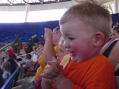
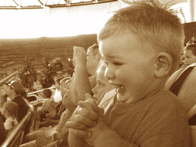
The expression on Drake's face was absolutlely priceless!!!! But the picture was not the greatest exposure. It was a little grainy. Probably because the camera settings were off. Maybe it had been set for taking pictures out in the bright sunlight, so when they got in the shade the aperture was too high. Whatever happened to it, the expression just had to be preserved. I am a fan of sepia so I decided to try some photoshopping to see if I could make the picture a little more softer. I converted to black and white and then used the color variations feature in my PS Elements 6 to increase the red and reduce the blue one notch each. I then used gaussian blur filter to soften the picture. Below is the result.
The next step was to pick the papers and embellishments. One of my favorite color combination is blue and green with Sepia pictures so I went to my paper closet and picked out my pattern paper, inks, stamps, and stickles.

I decided I wanted to add some subtle texture to the page so I got my roll of drywall tape that I purchased at Walmart and some alcohol inks and colored it using Ranger Alcohol Inks. The colors I used are Stream and Pesto.
 When I do a layout, I put everything in place. I move things around. I choose all my embellishment. I lay everything down and decide if I am going to do any machine stitching. I stamp or distress the edges of my background paper. Once the pictures and embellishments are in place I work on my title.
I found a vector graphic for this SeaWorld Logo, so I decided to play with it in my KNK Studio Software. I created double mats and then decided to cut it out. This is what I got.
 I loved how it turned out with the little Shamu in the center of the O. But I wasn't thinking. HMMM when I laid the completed title on the page, the white in the logo DID NOT look good with the sepia picture. But I had worked almost a full day deciding on the layout and creating all the elements. I didn't want to waste it.
I went to my basket of pictures that I keep on my table and found one of Adler that Mike had taken for April to give to Zach for his 1st Father's Day.

It was the right colors to go with the layout that was ALMOST finished except for the glue. The new picture was a vertical shot, where the one I planned to use was a horizontal shot. That was easy, just flip the mat.
That filled the spot where I planned to put the title at the bottom of the page and freed up a spot at the left side of the page. Now to plan the title. The first thing that came to mind was Blue Jean Baby because of all the denim, so I went to my KNK Studio software to create the title and mat and cut it with my KNK Element.
Once I postitioned the Title on the page it just needed one more thing to balance it out. I found some Fancy Pants Chipboard Scrolls and painted them with L'il Davis Metallic Acrylic Paint in Ice color.
Once I was happy with the finished layout, I was ready to glue and add Stickles.
AND HERE IS THE FINISHED LAYOUT.

So now I had the sweet picture of Drake that was still calling out to me to be on a layout and the really cool Sea World Title. The easiest thing to do was to go to my Paper Closet and find paper to match the Title......
This is what I came up with.

I punched some circles of the double sided damask print, and some black and white solids. On the solids I stamped some words with Versamark and heat embossed with black or white embossing powder. I found a glittered flower in my stash that matched. Printed a journaling block and matted it.
I got the layout finished and now I needed a picture that matched it. So back to the original picture and Photoshop Elements 6. I converted the picture to black and white. And then ran the Gaussian Blur Filter to soften it.
Here is the black and white picture.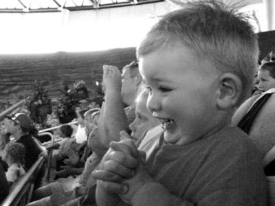
AND HERE IS THE FINISHED LAYOUT.


1 comment:
That photo of Drake is definitely priceless! Love it!
Post a Comment